AI Image Detector
Redesigned the user journey of a DARPA-funded AI/ML tool for investigative journalists to support new features
In October 2024, I was introduced to an AI image detection tool developed by Dr. Jason Davis, the research professor leading Newhouse’s Semantic Forensics (SemaFor) program—a DARPA initiative that "seeks to create a system for automatic detection, attribution and characterization of falsified media assets".
I was tasked with reimagining the tool’s interface and workflow. The aim was to develop an intuitive and efficient experience for journalists and other end-users, enabling them to easily understand and act on complex AI detections.
Role
Product Designer
Tools
Figma
Timeline
Oct. 2024 - Jan. 2025
RESEARCH & PROBLEM
Too many cooks in the AI kitchen
Problem Statement: The rapid rise of deepfakes and synthetic media has made it increasingly difficult for investigative journalists to verify visual content. A reliable AI image detection tool is essential to ensure accuracy and maintain public trust in reporting.
User Persona: Sarah, a 38-year-old investigative journalist working for a national news outlet
User Needs Statement: "Investigative journalists specializing in mis/disinformation need a reliable and efficient AI image detection tool because they must quickly and accurately determine whether a picture is AI-generated or real. This ensures journalistic integrity and helps prevent misinformation."
Although Dr. Davis and his development team had built a functional prototype in Streamlit, they needed support integrating additional features—most notably, three distinct detectors that produced different results based on their training data and were designed for unique use cases. Drawing on insights Dr. Davis had gathered through his ongoing conversations with journalists, we honed in on a few key pain points and refined our focus to the following areas:
Most of my time on this project would end up being spent thinking about this user flow.
WIREFRAME
Don't bury the lede (or the model selection)
My primary goals at this stage were
Establishing the user journey, specifically whether the file drop should come before model selection, and whether results from all three models should appear at all
Accounting for all the foundational functionalities carried over from Dr. Davis’s original prototype
I ended up deciding that the user would first select one of three models prior to the file drop for two reasons:
By choosing the model up front, users can decide which detector aligns best with their specific concern. This way, they only get results relevant to their suspected issue, avoiding confusion and unnecessary data from tests they don’t really need.
If users upload an image before choosing a model, they may hesitate or second-guess which detection method to use. A model-first approach eliminates this friction by guiding them through a predetermined, confidence-boosting sequence.
One consideration was that offering users a selection of all three models at the start meant the system had to load and prepare each model in advance, increasing initial processing time and resource usage. This added to the overall computational load, but it was a worthwhile trade-off to ensure a streamlined and intuitive user experience.
PROTOTYPING
Prototype 1
I then moved on to our first high-fidelity prototype, focusing on refining the visual design from the wireframe and incorporating the finalized names of the individual detectors. At this stage, I also introduced additional visual elements—most notably, the circular “Human/AI” indicator, which I had identified early on as the primary way the tool would communicate outcomes to users.
Some shortcomings of this first prototype were:
The columns were not immediately identifiable as "clickable".
The columns were overly text-heavy, contributing to higher cognitive load.
The layout appeared disjointed prior to detection due to the combined upload and results sections.
Prototype 2
My primary goals at this stage were to resolve the issues from the first prototype and enhance the detector selection process using microinteractions. The branding was also adjusted as to remove the association with Syracuse University. You can find the full breakdown below, along with a video demo of the flow:
REFLECTIONS & LESSONS LEARNED
A good first try
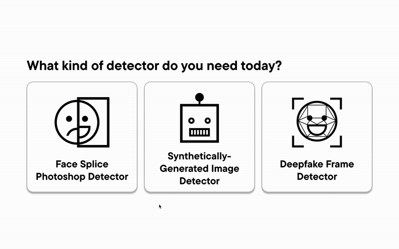
While I was regretfully unable to conduct formal user testing of this prototype within the project timeline, as the design files were passed off to Dr. Davis and his team of developers, my redesign focused on clarifying the user journey, simplifying the flow of interaction, and ensuring that newly introduced features (such as the three detectors and the "More Information" tab) felt intuitive and contextually relevant. By reorganizing the interface around clear entry points and decision moments, I aimed to reduce ambiguity and build trust in a tool that deals with complex, often sensitive content. Still, there were a couple of things I can’t help but wish I’d done differently:
  • Take more ownership during the design process: I wish that I had taken more initiative in the research phase by asking for a seat at the table during user testing. Being more directly involved in observing how users interacted with the product would have helped me catch pain points earlier and advocate for design changes with more confidence.
  • Establish and maintain a line of communication with developers: By the time I handed off my second prototype, Dr. Davis’s developers had already built a working version of the first in Streamlit. I should have pushed for earlier conversations, especially since the second prototype ended up diverging significantly. More communication would’ve helped me better understand technical constraints and align our efforts.
  • Accounted better for delays: There was already limited overlap between my schedule and Prof. Peruta’s, and adding a full-time research professor into the mix made scheduling even more difficult. As a result, the project took much longer than I originally anticipated, though I was also juggling other work for the SemaFor program during this time.
This project was featured in the following presentation delivered to the '24-'25 advanced media management cohort and Syracuse University alumni at the Lubin House in New York City in March 2025: